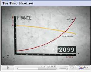
Graphic illustration of the difference between the second best and the best projection
Why be modest when you have proven you are right
The graphic illustration of the difference:
Excerpt from:
Europe in the twilight of its demographics
J. L.– 1.12. 2008
"Now the reader should see the film ‘The Third Jihad’ (Trinity, 2008). It is bothering, no doubt, but the situation in the USA is still several dimensions better than in Europe. In an interview with Mark Steyn commenting the general conviction that the Muslims in Europe ‘are so few, only some percent of the population’, he says: “Many people think it will ‘take centuries’ for them to become majorities”, there is shown the likely demographic development of Muslims and non-Muslims calculated for France’s actual fertility rates of 1.4 vs. 3.8..." :

(Excerpt continued)
"The result may surprise the optimist: The break even point is reached before the end of our century – around 2087. And this is merely a calculation on the basis of the demographic reproduction rates, not even considering (1) the ongoing family reuniting, (2) continuous further immigration, (3) the illegal immigrants of today (supposedly millions), (4) continuous illegal immigration, (5) repeated amnesties for hidden immigrants (as a strong motivation for trafficking of asylum seekers), (6) the fact that Muslim fertility could be increased deliberately as conscious means of politics (already outspoken by many Muslim leaders), (7) increasing emigration of endogenous Europeans (which already has begun in several countries), and (8) that political decisions during their growing democratic power could lower the obstacles for Muslim immigration or even facilitate it (e.g., the EU-Africa commitments of the EU-Mediterranean ‘Barcelona Process’ etc.). All these powerful factors included, a better demographic simulation than the one above could result in a much more bothering timeline..."
But I'am afraid the truth is it dismantles 40-50 p.c. quicker than even Jehu Lentius imagined or calculated 1.12.2008, especially if you look critically at the official figures as we certainly did last summer in order to come closest to the truth. Our three alternative rising curves then begin a little higher on the y-axis, because we naturally have corrected til startingpoint i.e. made a corrected realistic population balanced sheet before we projected the groups of population, but our curves do not even rise as fast as does those refered to or calculated by J. L. 1.12.2008. And even then the three rising curves intersect with the falling curve at least 40 year earlier:
'Some will certainly contradict us persistently and perhaps one might even point out that the first diagram concerns France, the second Denmark. But does this really matter when I tell you that France might come first.'
Graphic projection 2008

Now I would prefered some video - all in good time
Sonia
"if your heart is filled use your brain"


